Barack Obama - Editorial Portrait
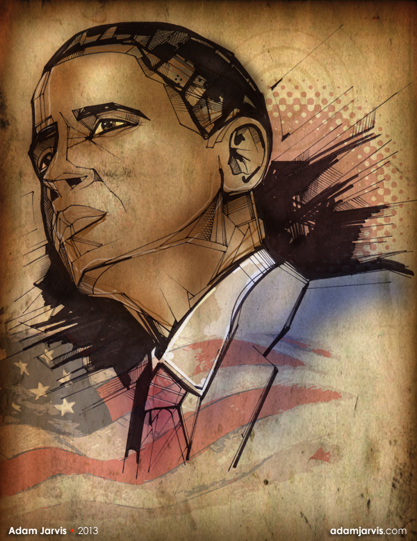
This is an editorial illustration of Barack Obama.
Barack Obama
Editorial Portrait
::
One of the great things about being self-employed, is that when you get a break between jobs you can do whatever projects you like. This time I chose to pick up a pen and do some good old fashioned drawing.
::
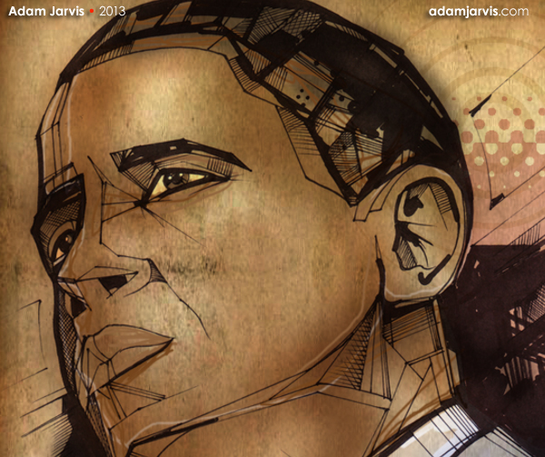
Now, I'm not even American, but I still find Barack Obama's "polarizing effect" on the world inrigueing subject matter for a portrait. This is not the same man the world rallied behind. The one who promised Change. Things have changed. You can see it in his eyes.
I always approach editorial illustrations with thoughtfulness and craftsmanship.
I'm not going to lie, it has been a while since I picked up a pen for anything more than signing a Visa bill at Chucky Cheese. So this opportunity gave me a chance to feel like an artist again. I enjoyed creating it.
::
This image is not politically motivated. Only artistically.
* Measure it as such.

The Approach
I started with a sharpie and an 8.5 x 11 sheet of white printer paper. Just doodling, trying to understand the subject matter.
Unlike the brilliant vector illustrations by Sheppard Fairey that launched Obama's meteoric rise to the Presidency, I wanted this portrait to be reality. Not a campaign poster.
It was important to capture the man that he is today, rather than the President he was expected to be.
This is a complicated man, who is sitting in the eye of a hurricane of pressure. Enough to crush a man or turn him into a diamond. Certainly he is not the same man who enchanted us all with a message of "Hope".
Like him or not, he has earned his own place in history.
Like him or not, he has earned his own place in history.
He has aged. Put on "a few miles" and a couple of gray hairs. But still standing amidst a defining point in history.
How will he be remembered? Who is to say for certain? I decided to focus my attention on crystalizing the man right now. This is my snapshop:


Technique
I used a ruler and a light table to hatch out some interesting geometry and block out the shapes.
It felt great to put the mouse down and just put pen to paper again. (As I mentioned) It's been a while.
::
I then scanned the image and superimposed it over some parchment texture. I looked for something that (like the man himself) had some character and age to it.
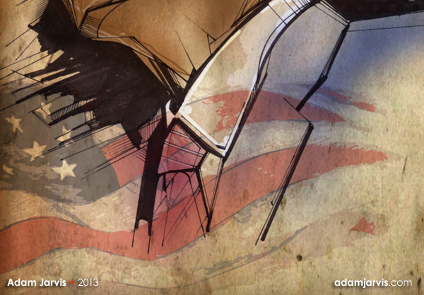
I then overlayed this vector flag image from my vector art collection. I think that it was a measured addition.
I enjoyed working on this. I'm glad that I took the time to revisit some of my artistic foundations. I hope that you like it.
•

Available for purchase
If you are interested in publishing this image along with some editorial content
or you have a budget for a customized commissioned editorial image:
please contact me.
I have a diverse range of illustration styles.
Adam Jarvis ©Copyright 2013